
Redesigning comments for scalability in a collaborative feedback tool
MarkUp.io is a collaborative feedback tool for adding live, contextual comment threads to websites, PDFs, videos, and more.
Problem
Users wanted to hover over pins to read comments, but the current setup required clicking and panning to the sidebar. The design system was outdated, not scalable, and needed to align with the parent company’s system to support future integrations and collaboration.
Solution
We redesigned the commenting system completely: we cleaned up the interface, created hover preview and states for comments, reorganized the navigation, and aligned it with our parent company's system. The new commenting feature also built a strong foundation for future integrations and features.
Impact
More streamlined and scalable design system, leading to faster design to implementation
Aligned and merged design system with parent company’s system, helping future integrations
2x user engagement & project creations, the most impactful update that year
Outcome
After the team finalized designs and began production, I transitioned to a new team following an internal reorganization.
Role
Design Lead
Timeline
December 2022 - April 2023 (4 months)
Team
Design lead (myself), 1 Junior Product Designer, 3 Engineers, 1 Product Manager
My involvement
Led team from ideation to design
Mentored junior designer while contributing to key features
Collaborated with Product Manager to define PRD for design execution
Collaborated with designers and engineers to align and merge design system with parent company’s system
Conducted design critiques with designers and product managers to ensure quality and alignment with the vision
Enhanced the design system to accommodate future scalability and new features
Project objectives
What were we looking to achieve?
Simplify comment management
How can we improve navigation, editing, and replying to comments directly on the canvas?
Streamline key actions
How can we make resolving, editing, and managing attachments more intuitive?
Enable scalability
How can we redesign commenting to support future features and integrations?
Unify and enhance design systems
How can we align MarkUp’s design system with the parent company’s while improving collaboration?

Process
What were the steps we took?
Competitive analysis
We researched how leading platforms like Frame.io, Figma, Ruttl, and Pastel, handle comment management for multimedia files to inform our design.
Comment flow audit
We mapped out the existing user flow to fully understand the pain points and inconsistencies throughout the process.
Weekly team check-ins
I led weekly design critiques with our product manager to make sure all design explorations and iterations were aligned with our goals.
Brainstorming sessions
I mentored our junior designer through collaborative brainstorming sessions, focusing on user scenarios and edge cases to strengthen their UX thinking.
Final shipped designs
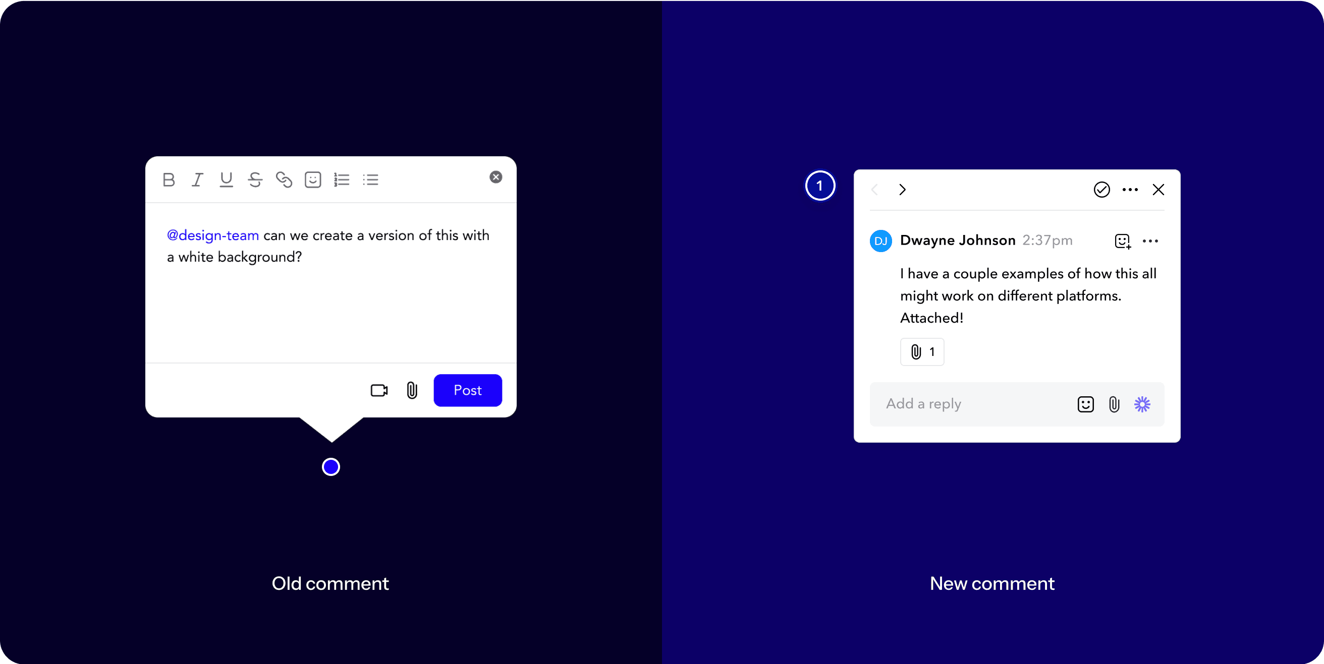
Streamlined comment cards
The new comment system allows users to write and read comments directly on the canvas in multiple orientations, incorporating all functionality previously limited to the sidebar.
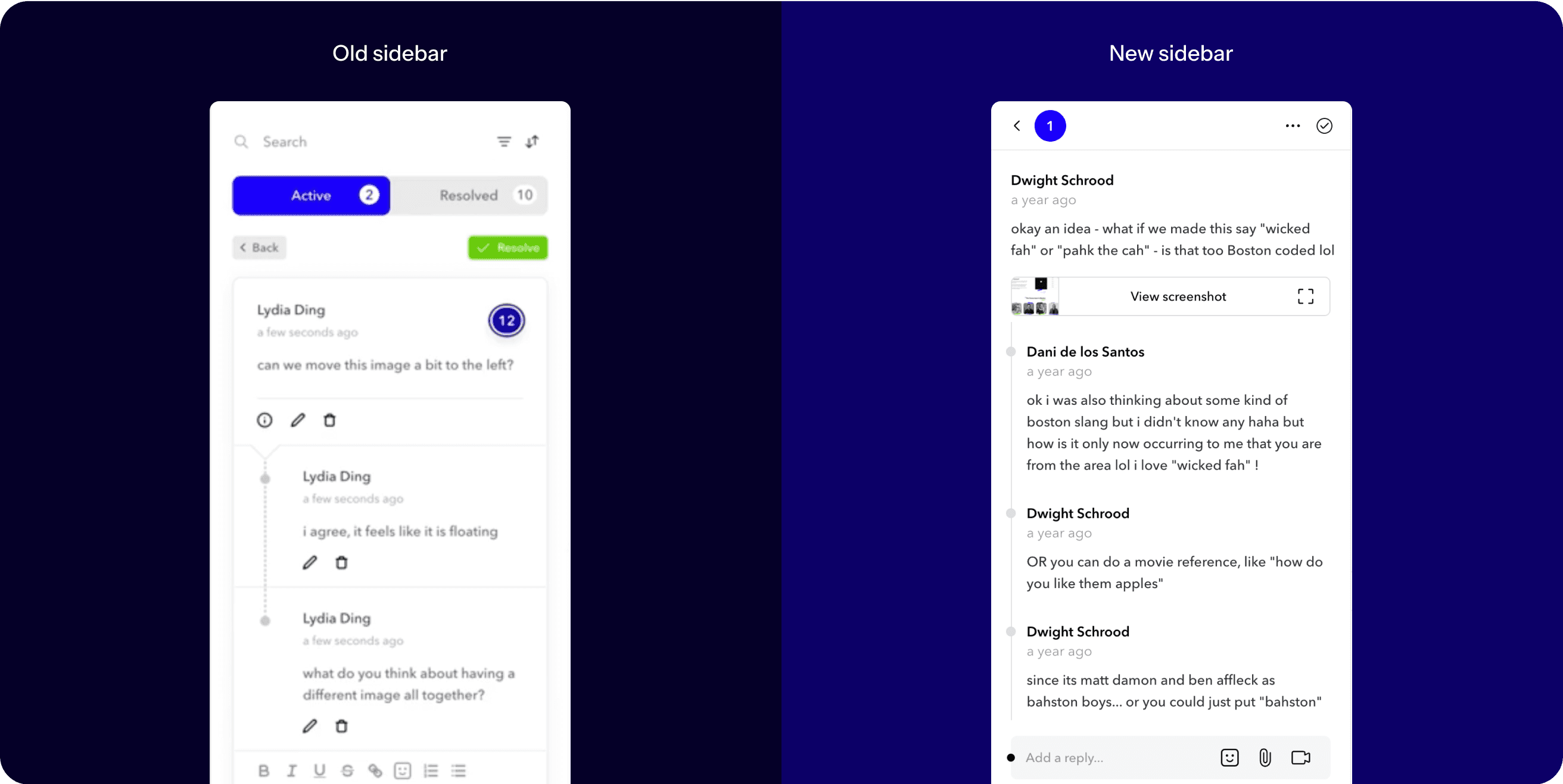
Streamlined comment sidebar
Streamlined the comment sidebar by removing unnecessary visual elements and functions like drop shadows, bright colors, and lesser used features for a cleaner, more efficient interface.
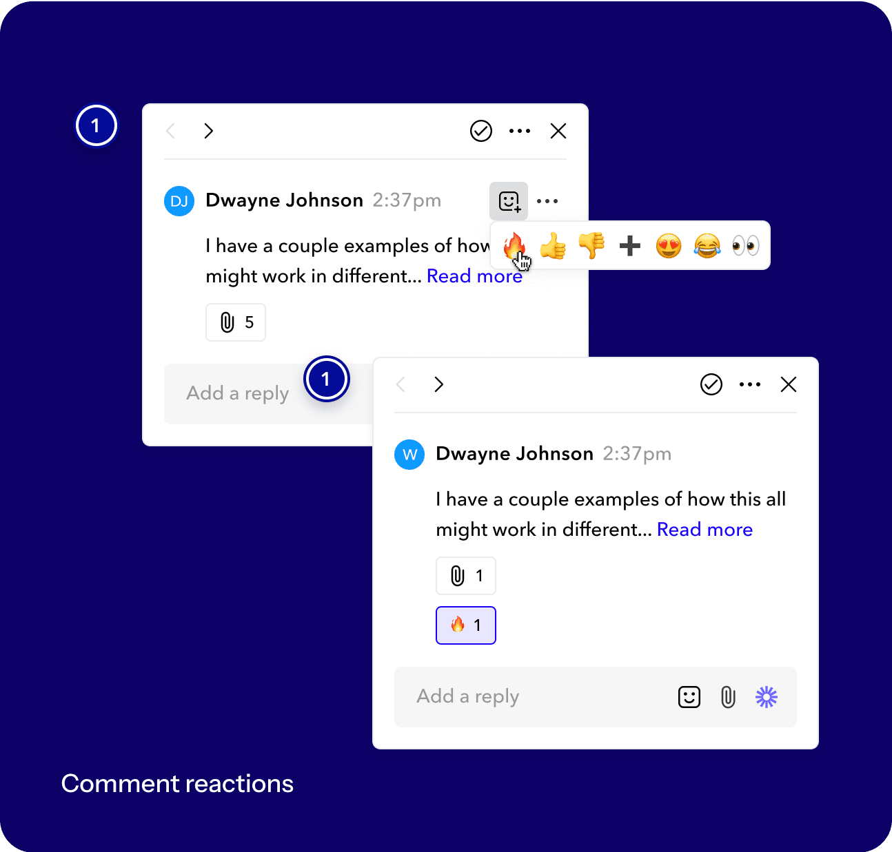
Emoji reactions
We created a new system to allow users to react to comments instead of needing to respond.
Rearranged comment canvas
We placed the utility bar at the top of the screen to catch users’ attention.

Takeaways & reflections
What did I learn from this project?
Address edge cases
This project reminded me how important it is to continuously test designs to handle different user scenarios and ensure it works in real-world situations.
Focus on usability
As a perfectionist - perfection isn’t always necessary. It’s more important to prioritize making the design easy to use and functional over striving for every detail to be flawless.