
Redesigning item management for engagement and growth
Shelf is a social media app that connects people through their shared love of music, books, movies, and games. Users can show off their personalities by featuring their favorite multi-modal media.
Problem
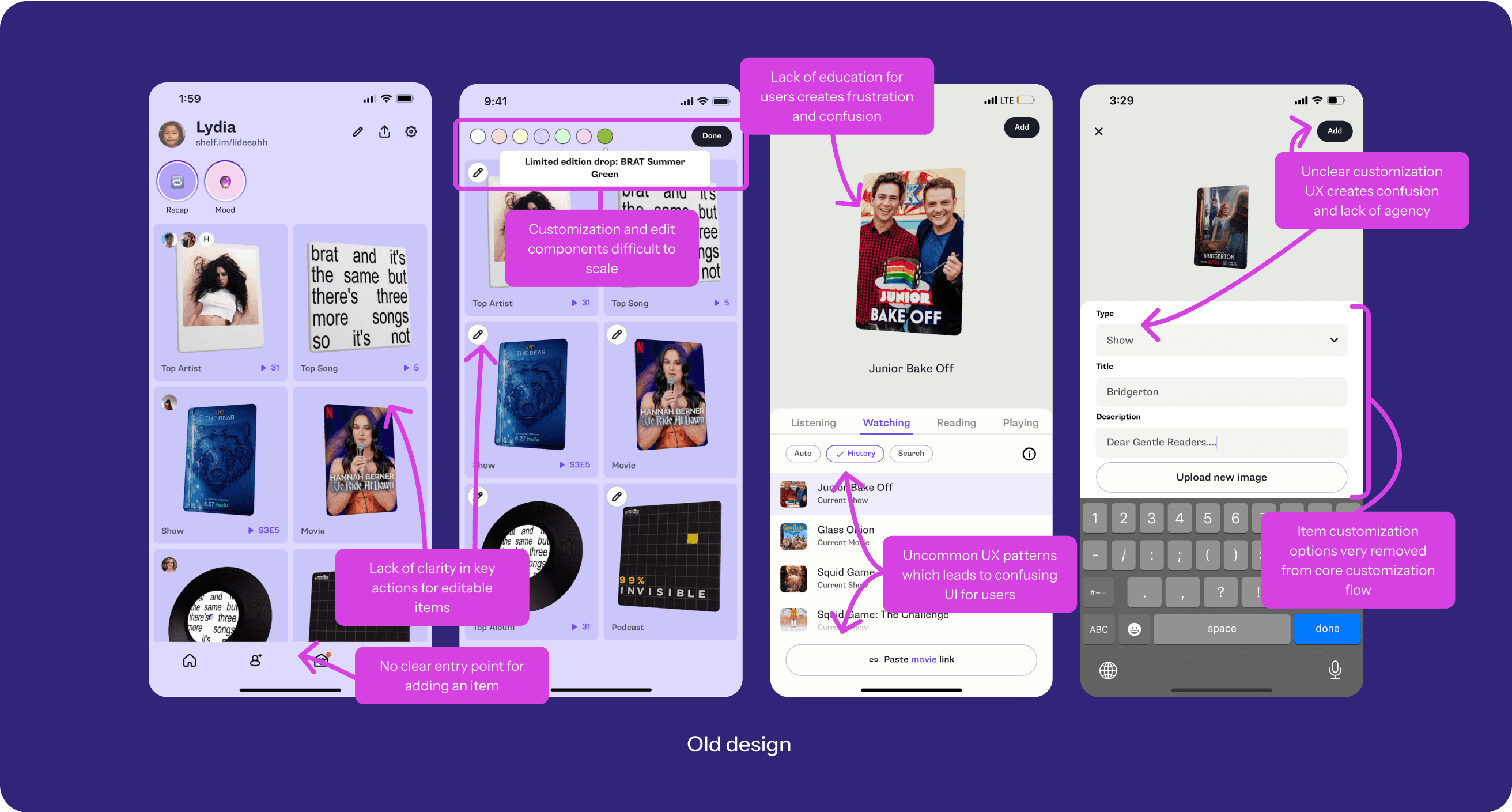
Customization was supposed to be one of Shelf’s biggest differentiators, enabling users to curate their media identity—but it wasn’t working.
Solution
We consolidated all editing functions into a single, streamlined interface. Key improvements included dynamic menus and status indicators, while removing infrequently used features to reduce clutter. We also tested a new emoji trinket feature.
Impact
4x decrease in duplicate entries; increasing data quality
70% of users customizing themes in onboarding
+55% in users adding multi-media items across categories
Item menus are now the 2nd most used edit entry point
Role
Senior Product Designer
(interim Product Manager)
Timeline
July 2024 - August 2024
Team
1 designer (myself), 1 community manager, 3 engineers, CEO/Founder
My involvement
Conducted landscape analysis and mapped existing user journeys
Created and tested functional prototypes with users
Led cross-functional workshops to align priorities
Authored product strategy and product spec docs
Designed and iterated on new customization flows with community feedback
What were we looking to achieve?
Improve visibility of customization flow
Make it easy for users to find and use customization features, increasing engagement of Shelf’s core user flow.
Design a cohesive system
Consolidate all customization options together into a single cohesive, scalable interface.
Create a delightful experience
Provide an intuitive and enjoyable experience that encourages users to personalize their Shelves, which will help drive retention and sharing behaviors.
Resolve technical debt
Enable future scalability and innovation for upcoming customization features.
Early insights
What compelled us to work on this problem?
High demand for customization
Customization was the 2nd most user requested feature, specifically around themes, trinkets, and item descriptions.
Higher engagement and retention
Users who edited their Shelves were 30% more likely to share and had higher retention rates.
Usability issues
Users rarely customized their Shelf - only 11% of active users edited items in the last 30 days. Many also added duplicate items, indicating confusion with the interface.
Technical limitations
Existing engineering and design constraints limited app scalability, particularly in adding more themes and customization options. We needed a more streamlined approach to customization and Shelf editing.
Process
What were the steps we took?
Landscape analysis
I analyzed 8 apps to understand how best-in-class apps handle customization and curation flows: Tinder, Hinge, VSCO, Unfold, Linktree, Shuffles, Spotify, and Pinterest.
Comprehensive flow audit
Since customization flows were scattered throughout the app, I created a holistic view of the entire system as-is.
Workshop
I led a cross-functional workshop to help clarify and align on priorities.
With technical debt and varying opinions on prioritization, the workshop helped determine what was feasible while balancing essential and nice-to-have features.
As a simple experiment, we opted to surface emoji reactions on Shelf items to explore user interest in custom trinkets.
Iterative design & testing
Since there was no way to track and compare certain user behaviors, we relied on user interviews and direct observations while user testing to both validate decisions and refine design iterations.
Initial designs & research insights
We interviewed 5 net-new users to understand NUX comprehension, and also surveyed 10 existing Shelf users.
Improved navigability and user comprehension
Overall, we noticed users showed a better understanding of how to add, manage, and customize items through the new flow.
Edit mode confusion
The edit interface wasn't intuitive - users had difficulty understanding their available actions, even with exposed drawers and controls.
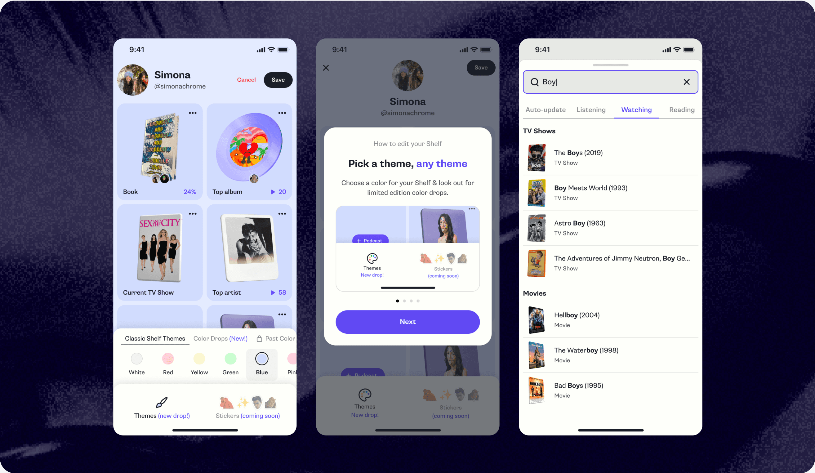
Next iteration: We designed the new interface to feature a canvas-style interface with clearer, more tappable buttons to help users understand they're in edit mode.
Confusion around what items they could add
Users were struggling to know what had been added to their Shelves or if anything had been updated.
Next iteration: We added alert modals and status indicators to clarify how actions in the add flow impacted users’ Shelves, along with red dots to notify them of updates or changes.
Tutorials were overlooked
Users tended to skip through tutorials, rendering them useless.
Next interation: Replace the carousel tutorial with a guided spotlight walkthrough that highlighted important UI.
Personalized emoji reactions were a hit
Users really loved the emoji reactions on items as a way to customize their own Shelves and used them as ways to add commentary.
Final shipped designs
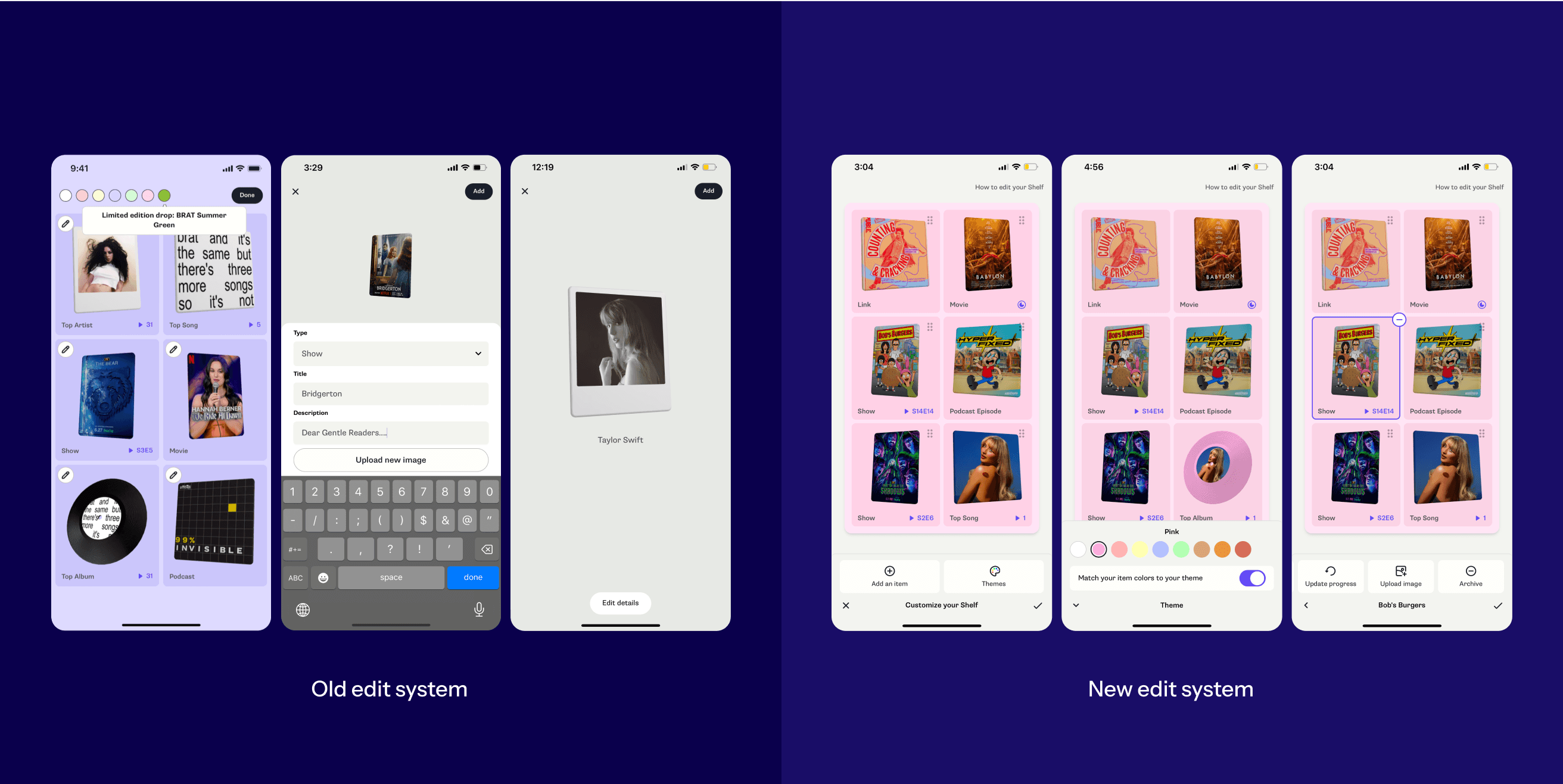
Making navigation simple and straightforward
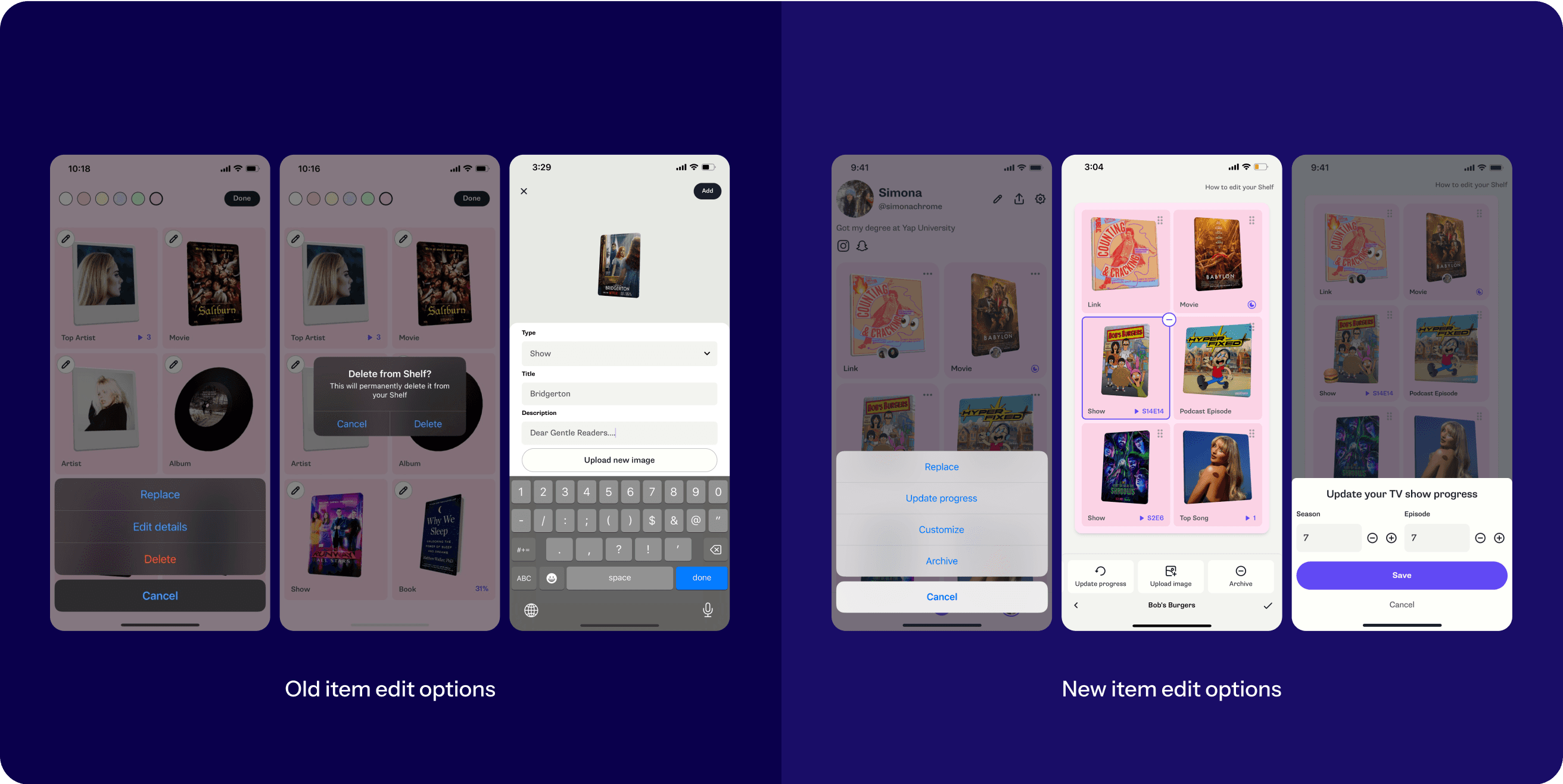
We simplified the editing flow with contextual menus and a unified system. In addition, users can now add items directly without having to replace existing items, making the process flexible and straightforward.
Experimental emoji trinkets
To test user interest in personalized trinkets, we surfaced reactions as visual badges.
Result: Since shipping, 10% of weekly active users add emojis to their own Shelves—5x higher than adding to others’ Shelves.
Potential next steps: Focus on features that add more personalization and reward social engagement.

Streamlining item customization
We streamlined item editing by removing rarely used options that were confusing and didn't serve Shelf's core mission. We also changed "Delete" to "Archive" and softened the warning message to reduce user stress.
Guided walkthrough tutorial
We added in a walkthrough experience to highlight different areas of the UI.
Challenge: Because of the technical and time constraints, we were forced to ship this iteration.
Potential next steps: Focus on redesigning the add flow to improve user comprehension

Cohesive UI and status indicators
We redesigned platform items to match how they’d look on a user’s Shelf. We also added action indicators to improve tap affordance. We integrated alert modals and toasts to provide guidance without using extensive tutorials.

Adding to Shelf: a unique challenge
Within the customization flow, we discovered that users struggled to understand the different types of media they could add, and how to add them to their Shelf.
Differentiating item types
A single flow for all items was too streamlined - users had trouble distinguishing between different item categories (search, auto-updating items via platform connections, custom links, etc.)
Platform connection confusions
Users believed they could only add items from connected platforms, and additionally many users thought they could only search within auto-updating items.

Future-focused design explorations
Due to timeline and technical limitations, we were forced to drop the project. With our insights in mind, I designed a few concepts to inform our future iterations.
Making item categories discoverable
In Exploration #1, I exposed all item categories in the default edit screen. While this risked overwhelming users, it allowed them to see all their options at once and take action based on what they wanted to do.
Giving equal weight to all item categories
I added more visible sections in the add item flow (Exploration #2) to highlight the different types of content they could add to their Shelf.
Takeaways & reflections
What did I learn from this project?
Test early and often
With technical and timeline constraints, we launched the project. In hindsight, I think we could have caught some issues earlier with simpler prototypes.
Early collaboration helps mitigate later conflicts
Aligning all stakeholders early on helped us balance different team priorities and made the whole project run smoother. This project really showed how important it is to prioritize, find middle ground, and keep communication clear.
Fix usability for better experiences
While tooltips and visual cues help teach users about customization options, I learned first hand that fixing the core usability problems is what really makes for a smooth experience.