Redefining IA & navigation strategy for a social media app
Shelf is a social media app that connects people through their shared love of music, books, movies, and games. Users can show off their media taste, connect with friends, and learn more about their media habits.
Problem
Users who joined Shelf found it difficult to navigate and often didn’t understand the purpose of the app, resulting in high churn and low retention.
Solution
To streamline navigation, we implemented a bottom nav bar highlighting Shelf's core features: activity feed, user profiles, and personal insights. The design provides clear visual feedback while maintaining simplicity and allowing for future expansion.
Impact
Significant decrease in user tickets complaining about usability
30% increase in new users sending friend invites
3x increase in user engagement within the app
Easier implementation with simplified app structure
Role
Senior Product Designer
(interim Product Manager)
Timeline
January 2024 - February 2024 (1.5 months)
Team
1 designer (myself), 1 community manager, 3 engineers, CEO/Founder
My involvement
Conducted landscape analysis and mapped existing IA
Designed and iterated on new navigation and IA
Conducted comprehensive app audit
Authored product strategy and product spec docs
Created and tested functional prototypes with users
Led cross-functional workshops to align priorities and clarify app’s main functions
What were we looking to achieve?
Improve app comprehension
How can we make it easy for users to find and use core features of the app?
Clarify main app surfaces
What’s the app’s purpose? What are the key actions users can take?
Enable scalability
How can we enable future scalability and innovation for the app?
Early insights
What compelled us to work on this problem?
User confusion and dissatisfaction
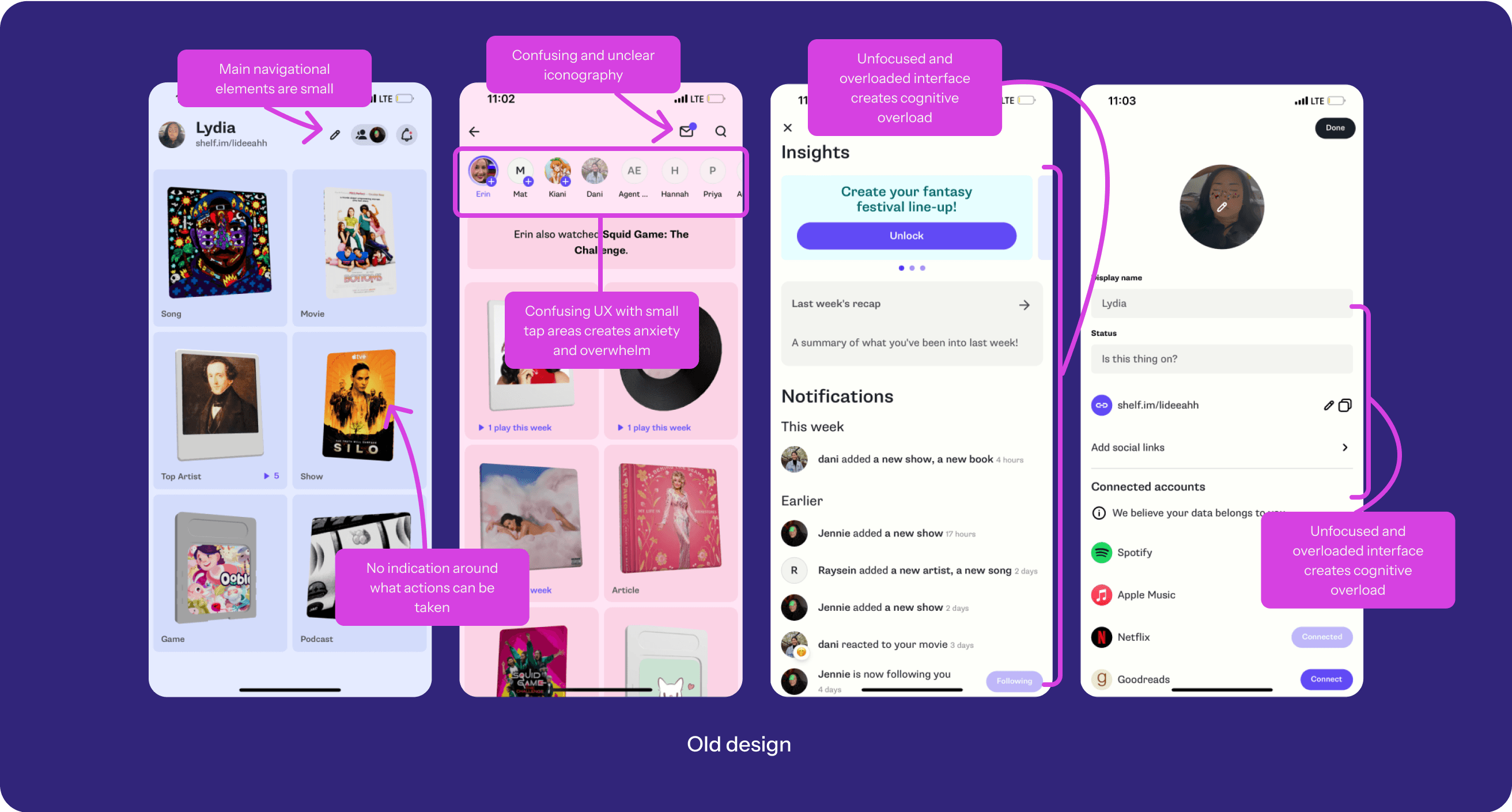
A large portion of incoming messages and support tickets were users unable to find features or getting frustrated with the app’s functionality.
Usability issues
Only 8% of users viewed the explore screen, which meant many users missed a key part of the Shelf experience. Additionally, only 4.6% of users followed someone on that explore screen.
Technical limitations
Existing engineering and design constraints limited app scalability, particularly around basic navigation and feature growth.
Process
What were the steps we took?
Comprehensive app audit
I led the team through a thorough audit of the app, combining user flows, existing tickets, UXR insights, app store reviews, our Discord community and analytics.
Landscape analysis
I analyzed major social media apps to understand how they handled navigation and major user flows.
Workshops
I led cross-functional workshops to align on priorities and clarify key user actions, balancing technical debt and growth needs.
Iterative design & testing
Since there was no way to track and compare certain user behaviors, we relied on user interviews and direct observations while user testing to both validate decisions and refine design iterations.
The main Shelf values
Through the audit, it was clear the team had differing opinions on the app's purpose. I led workshops to align the team on their mental models and ensure Shelf focuses on key actions and surfaces.
Showcasing a user's taste
One key value for users is the ability to show off their taste in media, and their personalities through customizing their profiles.
Connecting with friends and community
The second key value for users is being able to connect with their friends through media and find community through the media they love.
Learning about oneself
The third key value for users is being able to learn more about themselves through their media trends and habits.


Initial designs & research insights
We conducted 2 tests with 10 net-new users (5 for Ver. A, 5 for Ver. B) to understand NUX comprehension and sentiment.
Improved navigability and user comprehension
Users had a clearer sense of how to navigate the app and understood its purpose better.
Horizontal vs. vertical feed
Users found Version A’s vertical feed easier to use but associated it with traditional social media, while Version B felt more overwhelming, even though users said it offered a more innovative and exploratory way to discover people.
Next iteration: Since our goal was to improve user comprehension, we chose Version A.
Confusion around friend adding
Challenge: While the team agreed on insights and self-introspection as core to Shelf's value, there was a challenge in balancing growth actions with enhancing app value.
To test if clearer navigation would boost growth, we prioritized user search as a main tab over insights and self-discovery.
However, most avoided the tab after one try, seeing little value until they liked the app enough to invite friends. Users who did want to add/invite friends became confused about where to add them.
Next iteration: We combined adding friends with the activity feed to simplify navigation and make room for other features.
Troubleshooting the activity feed
We gated the activity feed, prompting users to add 4+ friends but most didn’t. Instead, we received complaints that it was too hard to convince friends to join without knowing the app’s value.
Adding your own updates to the feed
We added users’ own updates to the feed, showing value instead of just telling.
Tom of MySpace? You mean, Jad of Shelf
We had every new user automatically follow the CEO and community lead, like Tom of Myspace, to boost feed activity.
Focused add friends banner
We added a banner at the top of the activity feed to guide new users and encourage them to add friends.

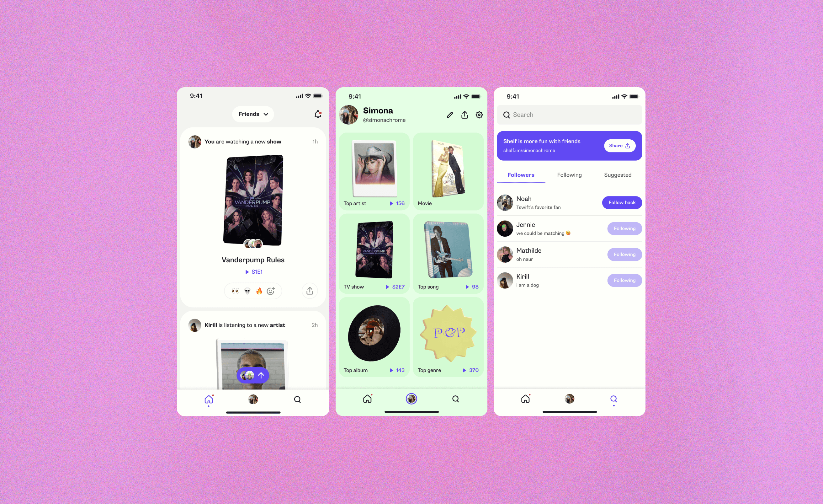
Final shipped designs
Making navigation simple and straightforward
We incorporated a bottom tabbed navigation to let users easily move through the app without getting lost.

Vertical activity feed
We simplified the horizontal explore experience into a vertical feed, showing the latest updates from friends' Shelves. We also exposed reactions, allowing users to react to their friends’ updates. Functional notifications, like reactions and new followers, were moved to a separate section.
Potential next steps: Because users seemed to appreciate the horizontal explore feed, it could be tested again if designed in a simple, easy-to-navigate way.

Insights for self-reflection
We added a dedicated Insights tab to help users explore personalized data and trends. It was designed for future growth while keeping navigation simple and intuitive. This change also reinforced Shelf’s mission to connect users with their media habits and self-reflection.

Takeaways & reflections
What did I learn from this project?
Focus and strategy are key
Having a clear understanding of our goals and mission is crucial. We can only help users see the value of the app with a strong foundation.
User growth vs. user experience
Choosing to focus on social features and growth loops vs. improving existing features could definitely hinder retention & long-term growth
Early collaboration with engineering is essential
Aligning the team early helps navigate technical challenges, ensuring clear communication and setting realistic expectations for what can be achieved.
Small steps are still progress
This project underlined for me that even small steps forward are valuable, helping to build momentum and uncover new insights along the way.