Building strategy & product design vision for a career management app
Workrise, a Series E company, connects skilled workers and expert vendors with reliable jobs, career growth, and stable benefits. Workrise's construction division wanted to design a career management app.
Problem
Workrise's product team wanted to create a mobile app for their construction worker division but the company struggled with an unclear brand purpose and unfocused product direction, which made it difficult for them to deliver an effective experience for their users.
Solution
We developed a comprehensive brand strategy for Workrise that included establishing a clear brand persona, designing a north-star vision prototype with key user flows (new and existing users), and creating a design system with a clear roadmap from MVP to our end goal.
Impact
Alignment across all cross-functional teams around a clear product vision
Unified and battle-tested design system across brand and product
Clear product roadmap from MVP to north-star for execution
Outcome
After getting approval from senior leadership for our final prototype and designs, Workrise made the difficult decision to close the construction worker division due to layoffs, and shifted their focus to energy and solar initiatives. We wrapped up the design system and files to provide them with resources for future projects.
Role
Senior Product Designer
Timeline
November 2022 - April 2022 (5.5 months)
Team
2 designers, 1 product director, 1 executive product director
My involvement
Conducted landscape analysis
Mapped out both ideal and existing IA and user journeys
Led cross-functional stakeholder workshops
Developed product vision alongside senior leadership, focusing on user retention and competitive advantage
Created a new design system and iterative MVP design system
Designed comprehensive user flow prototypes encompassing acquisition, activation, current user
Project objectives
What were we looking to achieve?
Define a north-star vision
What should the app’s north-star vision look like? How can we align the team and stakeholders around a shared goal for both new and existing users?
Reimagine the core user experience
How can we redesign the IA and user journeys to meet construction workers’ current needs while paving the way for future growth?
Innovate future opportunities
What new programs and benefits can we explore to deliver more value and drive deeper user engagement?
Establish a scalable design foundation
What does an MVP and scalable design system look like to support consistent, iterative development?
Enhance competitive advantage and retention strategy
How can we enhance user retention and competitive positioning through innovative product design?
Problems
What were the issues at hand?
User problems
Construction workers juggled multiple jobs and preferred paper records and phone calls over digital tools.
They valued independence and growth in their careers, so we needed to create simple solutions that would earn their trust while supporting both their daily work and professional goals.
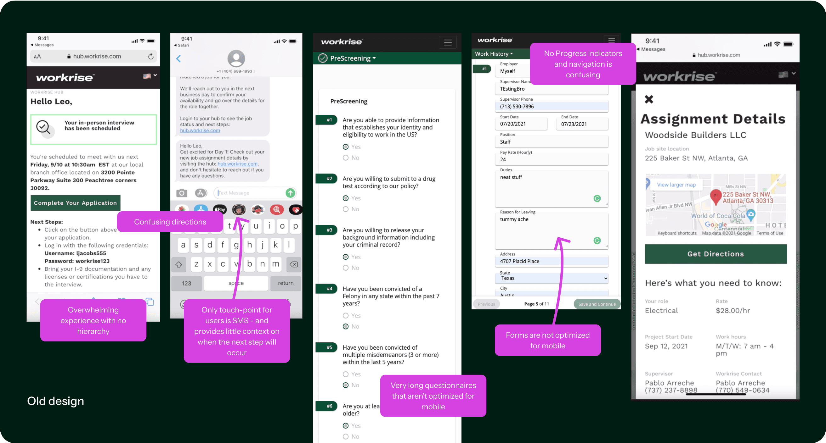
The existing onboarding experience was frustrating - users couldn't tell where they stood in the process or what to do next.
Business problem
The company was trying to serve its users with outdated, disconnected systems that weren't mobile-friendly or easy to understand. The team itself was struggling to figure out their identity and where the product should go.
Process
What were the steps we took?
Existing product audit
Through team interviews, workshops, and analyzing their Figma files, we mapped out and organized their existing workflows.
Brand workshop
Before we could plan the app's structure and navigation, we helped the team align on their strategic brand goals and persona.
Landscape and competitive audit
Competitive and best-in-class app analyses helped us identify features to boost retention and reduce roadblocks.
Collaboration with UX Research
We worked with Workrise's research team to better understand their users' needs and relationships with the platform.
Iterative design
We held regular check-ins with cross-functional stakeholders to ensure that our designs aligned with their user insights.
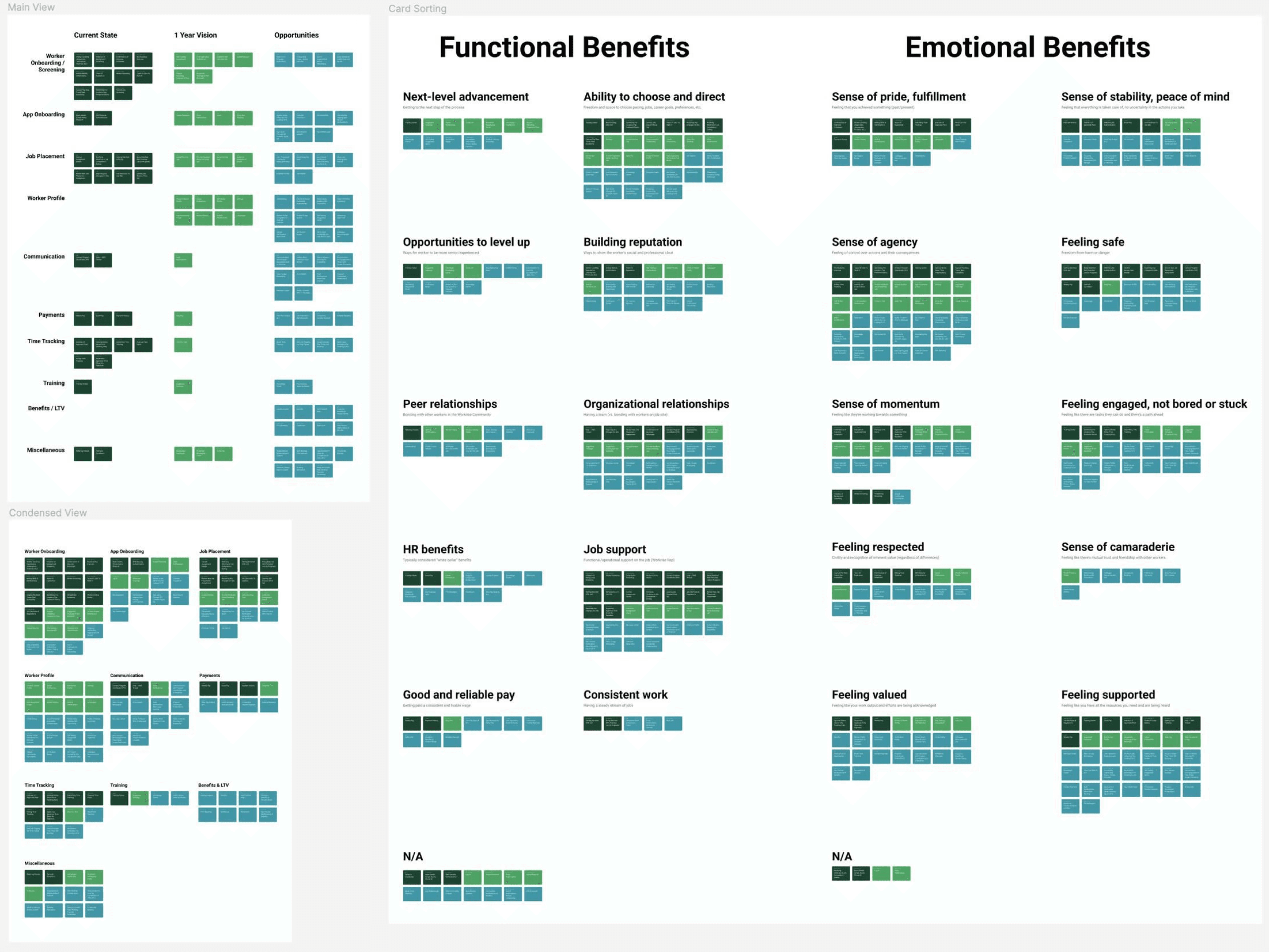
Emotional and functional benefits
To make sense of all the information we gathered, we created a color-coded system that helped us spot gaps in the experience, identify our strengths, and determine where to focus our efforts.
Brand persona & definition
Through multiple workshop sessions with the team, we crafted a brand persona to help the team clarify their positioning and to help guide our design and product decisions along the way.
Archetypes
Everyman; Sage
The ideal work mentor
Like the work buddy who’s a few steps ahead of you yet always happy to share their wisdom - the rules of the road, tips and tricks of the trade or advice on career advancement.
Feels like
A favorite tool in your tool belt, an experienced companion aligned with your needs.
Behavior
Help you stay on top of daily routines, helping you see around corners.
Attributes
Authentic, knowledgable, relatable, transparent
Evaluative research insights
What were some other learnings that made a key difference in our design decisions?
Program coordinators 🤝 construction workers
Workers heavily relied on their PCs (Program Coordinators) and would call them often for guidance and support.
Making critical information accessible
Information about worksite safety/quality, assignments, and document requirements were hard to obtain.
Gamifying engagement
Roulette games and cash prizes were extremely popular at Workrise field locations as a way to incentivize workers to come in.
Design for growth & scalability
A flexible IA was necessary in order to accommodate future features and growing programs.
Career stability & growth
Two key differentiators for Workrise as a brand were their ability to provide career advancement and stable benefits.
Final designs
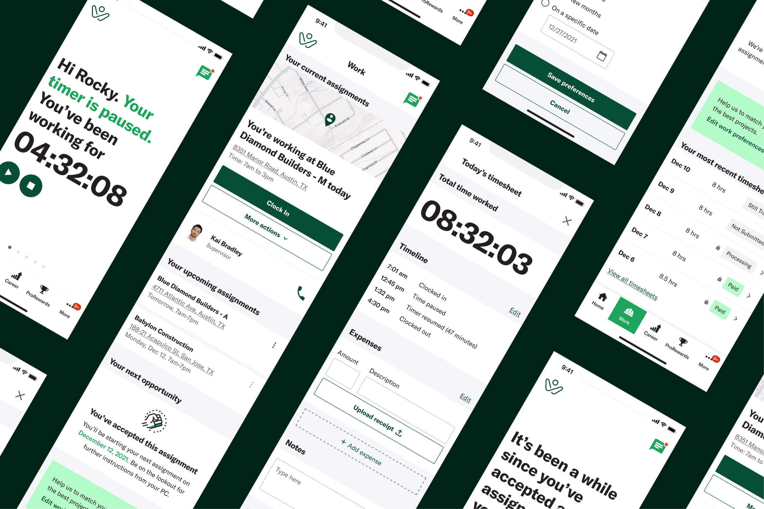
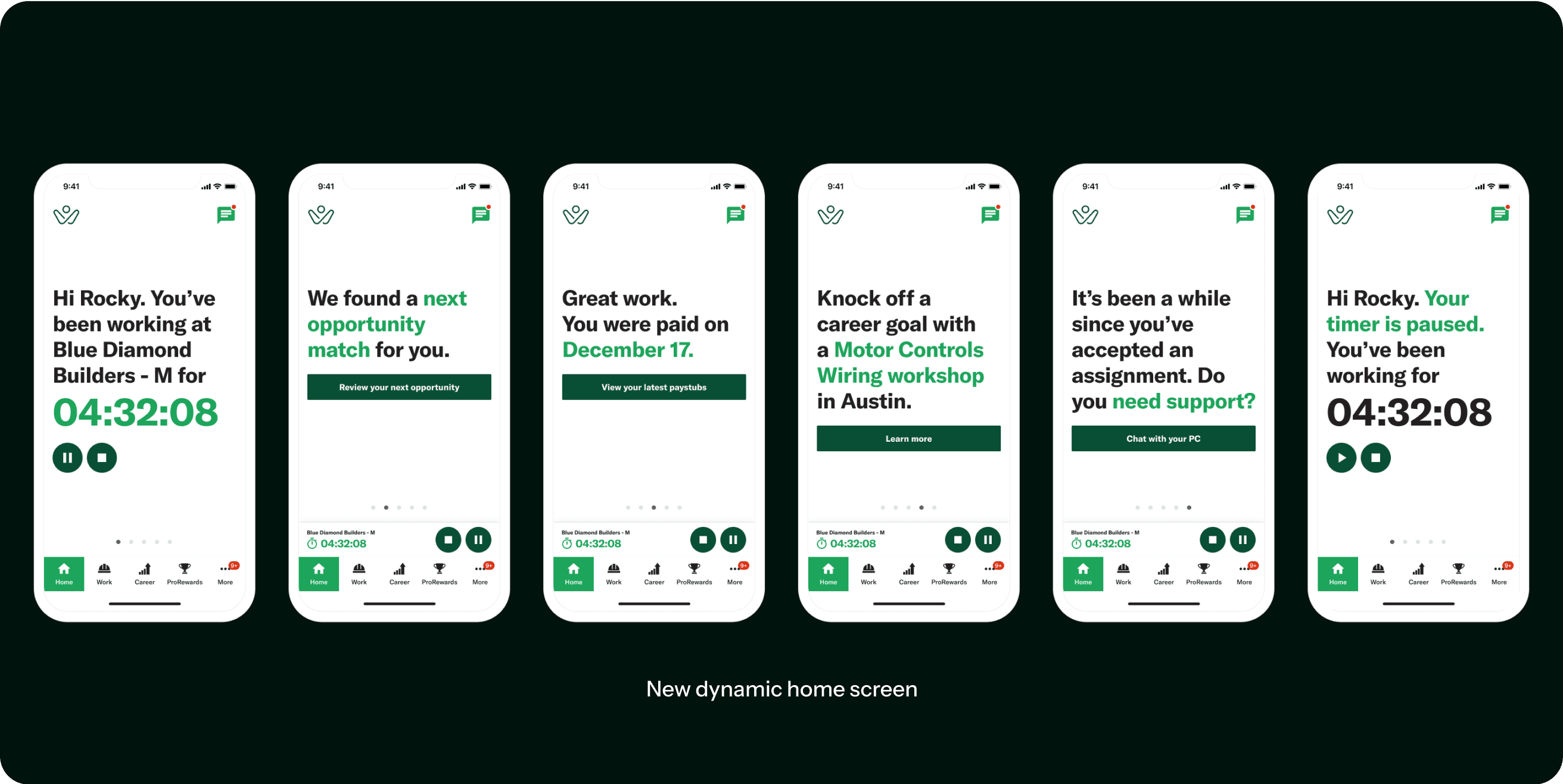
Dynamic and focused homepage
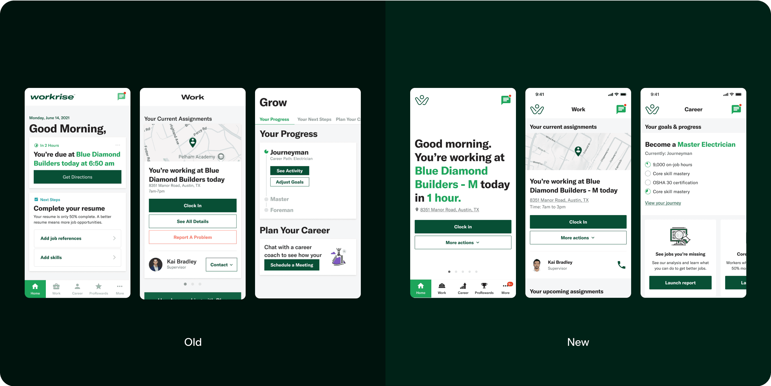
We designed a dynamic home screen that adapts to the worker's current status, providing quick access to relevant information and tasks to help them stay on track and achieve their career goals. It adapts to their day, keeping them on track with timers, reminders, and other goal-oriented messaging.
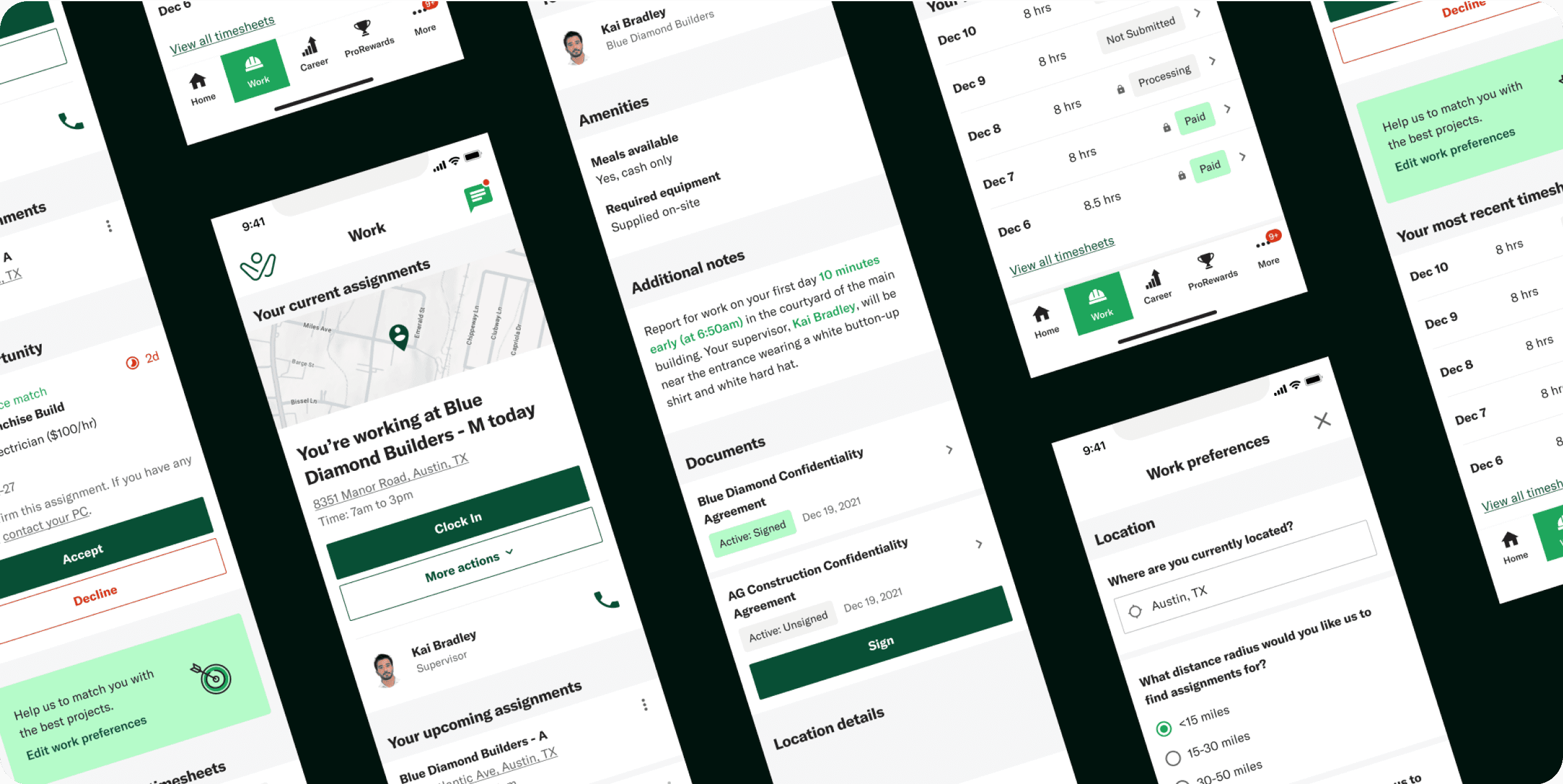
Flexible and focused navigation
We created a tab-based navigation system that organized work assignments and career goals, with a "More" tab to keep things simple. Clear labels and icons improved usability, and we developed a detailed IA map to guide both developers and designers.

Work assignments
The Work Tab provided quick access to all essential daily task information, including job site details, supervisor contact, documentation, timesheet statuses, and pay stubs. Workers could also manage job assignments and customize preferences for future projects.
Integrated chat support for workers
Our AI chatbot provided instant support, helping workers access assignment details, ask questions, or connect with program coordinators. It allowed them to resolve issues and stay focused on their tasks.

New worker profile
We built an online resume and profile system for workers to showcase their skills and experience. A verification system enhanced their credibility by highlighting Workrise-verified skills, while users helped promote the brand by sharing their profiles.

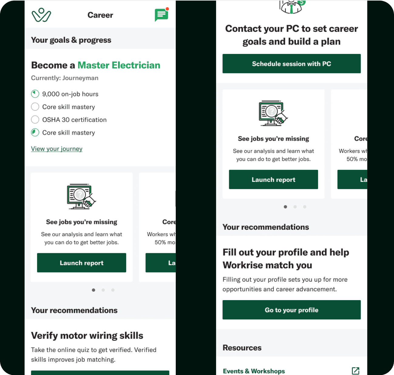
Career tab
Focused on career growth and trajectory, the Career tab shows workers tangible and actionable steps towards their goals. We designed both current user and new user flows.
ProRewards tab
Modeled after travel reward programs, the ProRewards page helps workers build positive habits by showing various in-app actions and tasks they can complete to earn rewards and points along the way.

Reenvisioning the design system (MVP to north-star)
Starting with Workrise's .com design library, we adapted it for their native app, creating a comprehensive design system. Through designing multiple flows and scenarios, we ensured a seamless user experience. We then developed an MVP and a streamlined design library to support the team’s work going forward.

A more modern and modular design system
To improve scannability, we limited bright colors for highlighting important information, and used iconography and illustrations to provide visual indicators and status affirmations. We integrated flexible content cards to streamline updates across pages, visually segment sections for easy scanning, and maximized screen real estate by eliminating side margins.
Takeaways & reflections
What did I learn from this project?
Finding diverse inspiration sources
Working on this project reminded me how important it is to find inspiration from all kinds of sources—not just competitors or similar apps. The best designs can come from combining great ideas and thinking outside the box.
The power of clear strategy and alignment
The best experiences come from a clear brand and aligned strategy. Taking the time to define these upfront saves a lot of time and effort later.
Collaborating for better insights
This project reinforced how important it is to work cross-functionally early and talk to people across the company. Those who are close to users often have great insights that can make a big difference in the design and strategy.